A Dream of the Sea

I’ve curated an exhibition that’s currently up at The Witham arts centre in Barnard Castle. It’s called a Dream of the Sea – the title was inspired by an old friend’s email address, I was at art school with Duncan, aka adreamofthesea@XXX, and he was a dream in himself – bursting with iridescent fun and wild imagination – an amazing guy, and a fascinating artist. Anyway,  the words A Dream of the Sea have always captured my imagination, and I so when I sat pondering a fitting programme of exhibitions for my role as Visual Arts Coordinator at The Witham this title sprang to mind. Barnard Castle is about as landlocked and agricultural as rural gets in the UK, but the vast majority of us ‘dream of the sea’ and of escapism – not least when the days are cold, long and dark, yet our anticipation of  Summer and coastal adventure is piqued by the Spring Equinox.

So here we have it, an exhibition called A Dream of the Sea that opened on Thursday 2, and continues until Saturday 25 March 2017. The exhibition spans the Gallery, Dispensary Gallery, and seeps/laps into the Shop at The Witham, admission is free, and access if from 10 am to 4 pm Tuesday to Saturday.

It’s a group exhibition, and clearly I think all of the artists involved in the exhibition are talented and their works have merit; however, there are a few whose work makes my heart skip a beat. Introducing Mark Sofilas…

Mark’s sun-drenched scenes of the Mediterranean make my toes curl with excitement – I can almost feel the sand between them, feel a warm coastal breeze on my shoulders, taste the Capri Rosso linger in my mouth, and hear the hum of  grasshoppers amongst the scrub-land. His works are so fantastically evocative place; of relaxed, romantic hillside works on  balmy evenings, of a refreshing swim or boat ride out to sea, of the brightly coloured, unfamiliar, charming flora bursting through sandy soils. I adore them!

Mark Sofilas lives and works in Leeds, some more about him…

“I am originally from Western Australia but migrated to the UK in 2008.  I was an illustrator with over 20 years’ experience in the advertising industry but took the opportunity, on moving to the UK, to turn to fine art, something which I had always wanted to do.

My paintings are very heavily guided by the emotions a particular scene or moment evokes in me. It’s this feeling that I try to convey to the viewer. It might be something as simple as smoke drifting from a chimney pot or silhouette created by a particular light source. It may be the strength or history, which emanates from an everyday object or piece of architecture.

The body of work I’m displaying here [in A Dream of the Sea] is inspired by a recent visit to Italy, featuring The Amalfi coast and the Isle of Capri. I have tried to capture the intense light of day and the magic that intensifies under the cover of night, in this wonderful part of Italy.

Over time I’ve discovered that I can best achieve this by exaggerating/enhancing colour, manipulating perspective slightly and pushing shape and form to arrive, hopefully, at a nicely balanced place, where the image created has not only captured the physical qualities of the scene, but more importantly, the feeling of the occasion… I take photographs of my subjects, but like to rely on memory and imagination, the ultimate goal being, to recreate exactly what I’m feeling onto a flat surface.

I don’t do preliminary drawings, instead I prefer to adopt a more organic approach and design the paintings as I go. This helps the end product retain a freshness and feeling of spontaneity. I always have an image and mood in my mind’s eye that I’m trying to put down and I find that working this way allows me to be flexible and go with any happy accidents that more than likely will occur. It’s these little surprises that I can adopt and learn from and take into my next painting.

I enjoy the journey that this direct and unstructured approach takes me on and find that it enables me to either get close to achieving what I had in mind and heart or on occasion, arrive somewhere unexpected but as rewarding.”

Contrastingly, in both geography and medium, I also adore the work of Lee and Jill Brewster.  They are a couple who live and work in Hurworth, County Durham, and have been working together since graduating in 1991.

They’re showing a new body of sculptural furniture in this exhibition that initially appears too tactile and sculptural to have any functional merit in the domestic or commercial setting. Yet when one sits down with it, touches it, works with it, it tells a story of enjoying and embracing nature with all its seemingly restrictive undulations… that aren’t actually restrictive at all, but refreshingly comfortable, and perspective enhancing. In short, I DESPERATELY want the desk and stool in my home!

Lee Brewster studied furniture design at Loughborough college of Art and Design and is currently studying for an MA at Teesside University in Future Design. Jill Brewster studied surface pattern and textiles, also at Loughborough, and then completed an MA in Creative Multimedia at the school of computing at Teesside University.

“We design and make sculpture, furniture, structures and buildings in response to specific environments. We are interested in making sustainable and emotional connections with nature using structure, texture and pattern.

Our current work is a response to our local environment, specifically the North East heritage coast, the theme of the sea and water frequently appears in our work. We work predominantly in wood and enjoy the free workmanship it allows us, making decisions about structure and aesthetics during the making process.

We are advocates of using responsibly sourced and renewable resources to achieve sustainable futures and promote socially responsible design. Our objective is to design objects and processes that enable a sense of wellbeing, and ultimately improve people’s lives through an emotional connection with nature.

The sculptural pieces of furniture included in this exhibition areinspired by our research into coastal environments and the pattern and textures left behind by the action of the sea.”

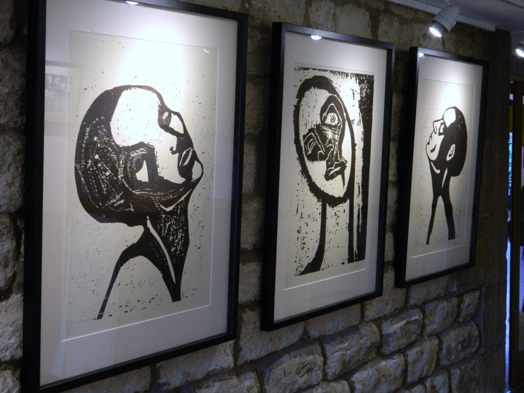
Other works in this exhibition that really ‘rock my boat’ in a positive sense, include a series of fabulous illustrations by Katie Edwards.

One of my very first memories is of walking between gigantic sand-dunes on holiday in Morocco. I was two years old, but I guess the landscape was so far removed from my norm (the North York Moors) that the memory stuck. The above print reminds me of the Isola San Giulio, an island within Lake Orta in Piedmont, northwestern Italy (where some friends got married a few years ago). What I adore about Katie Edwards’ work is the playfulness, that awe-infused sense of the extraordinary that is intrinsic to all of her illustrative prints.

There’s a sense of child-like wonderment to her work… as a child when I thought about our place in the world, in the universe I used to wonder if the universe was merely a tiny speck of dust in a giant’s pocket. It’s THAT freedom of imagination that I love about Katie Edwards’ work!

Perhaps inspired by the fantastic setting that she lives and works in… Katie designs and creates her conceptual illustrations from her studio located at the foot of Lake Windermere in the Lake District, using traditional photographic and silkscreen printing techniques.

Katie’s screen prints focus on conceptual ideas, symbolism and metaphors, and her screen printed illustrations reflect her enjoyment for the natural world, evoking thoughtfulness and humour. Katie’s innovative juxtaposition of elements often result in a surreal, humorous or thought-provoking image.

The original silkscreen prints are created from Katie’s most popular designs and developed as a limited print run. Each one being a unique, hand-crafted piece of art, individually printed, signed and numbered by the artist.

Achieving a first class honors in Graphic Arts and Design at Leeds Metropolitan University, Katie has since lived in London and Canada, working with clients such as The Observer; The Telegraph; Economist ; Psychology Magazines; Converse Shoes; National Australia Bank; Boothes Supermarket; Arla Dairy and Delta Airlines. Katie was awarded the Bridgeman Studio Award in 2014, for the illustration ‘Joy’. More recently, Katie was commissioned by E.H.Booths Ltd to create a piece of art in the form of a triptych for their new store in Milnthorpe, Cumbria.

In addition to exhibiting her work nationally internationally, Katie also enjoys success with work such as hand printed greeting cards, soft furnishings, t-shirts and tote bags stocked in galleries and arts centers across the country.

If you’d like to see these works for yourself, and many more beautiful works besides, then get thee to The Witham (3 Horse Market, Barnard Castle, DL12 8LY) before 4pm this Saturday! More info about exhibitions at The Witham here.

Molar by Jennifer Wen Ma

I’ve just been admiring this beautiful installation, Molar, created in 2016 by Chinese-American artist Jennifer Wen Ma. 

Molar is a new site-specific commission created for A Beautiful Disorder, a group exhibition of 16 Chinese sculptors at the Cass Sculpture Foundation. Many of Wen Ma’s works take landscape or nature as their subject matter; this installation offers a place of reflection in a disintegrating utopia, where beauty and destruction cohabit, and inspiration can be drawn from the diseased as well as the prosperous.

Watch an interview of Wen Ma in conversation with Studio International talking about Molar and her wider practice, now split between Beijing and New York.
The below text has been lifted directly from her website.


Ink-painted acrylic glass panels, 480 pieces of hand-crafted glass, flashspun nonwoven HDPE fiber leaves, 75 kg of Chinese ink, lights, wooden walkway, steel framework, sound files, and audio playback system. 
This new installation for the Cass Sculpture Foundation merges mythological, spiritual, and humanistic notions of Paradise, inspired by the surrounding West Sussex English gardens, to create an otherworldly secret landscape within the main gallery. 

Upon entering the gallery, visitors see tall panels of semi-mirrored glass encasing a blackened gardenscape occupying a large portion of the gallery. Openings in the glass panels reveal a reflective black landscape path in a pond of black Chinese ink, speckled with illuminated glass spheres. The form of this landscape is based on Chinese garden designs, drawing parallels between gardens of East and West. 

An enormous upside-down tree made from black paper hangs from the ceiling, nestling a large cluster of illuminated glass in teardrop shape, in quantity of hundreds to form a chandelier that measures approximately three-meters in diameter. These precious gems appear to be the fruit put forth by the sprawling tree. Lights emanating from the glass fruit come from various points within the cluster, bouncing from one glass to another. The cluster contains larger sized pieces in the center, skirted with smaller bits that get variably diminutive at the outermost perimeter. This tree chandelier reflects onto the surface of the pathway, ink pool, and mirrored panels, framed by the 16 glass pieces that float in the ink. The glass orbs are in various sizes with gold-flecked centers and lights emanating from within. 

The mirrored panels blur the boundaries between the gallery space and the installation, reflecting the installation while also permitting visibility to the space beyond. Viewers are completely immersed within the environment, and are free to walk and explore along the pathway. A simple and sparse music composition echoes within the inkscape through speakers.
Concept

This installation is an extension of my exploration of traditional Chinese ink painting in a contemporary framework. Landscape paintings on scrolls are meant to create a panorama and insert the viewer into the landscape. Chinese landscape paintings synthesize multiple perspectives into a single work, allowing nature to overcome the individual. This idea is interpreted here within a three-dimensional state, as the viewer has an immersive experience within the ink landscape. 
Mo, Chinese ink, has been the main medium for expression and communication for centuries in East Asia. It embodies all colors, emulates all forms, gives meaning to brush strokes, and aesthetic achievements. Concurrently, black is the culmination of all colors and absent of all light. It is also a powerful symbol of void and muteness. 

This work also meditates on the idea of paradise in historical and contemporary society as a continuation of my last three years of researching mythical gardens – from Babylon to the Garden of Eden Babylon–which led to the development of installation opera Paradise Interrupted. 

The word paradise means enclosure or park. Throughout history, humans try to break down the barrier of this utopian idea to get into or out of a paradise. Psychological and emotional paradises must also be grappled with–ideals of how life would be, notions about parents or caregivers, etc. We reconstruct our lives in accordance with new discoveries and persevere. 

The capsized tree of life hanging in the middle of the landscape is our broken paradise. Despite its state, it is still generously distilling its essence into the gems. The gems that sparkle in the pond and hang from the tree are shaped like commas, tear drops, sperms, embryos, tumors or perfectly shaped spheres. They are the fruits of inspiration that are borne by the blackened tree of life. The semi-reflective panels surround and protect this magic while reflecting the interior and showing us ourselves, thinly veiling what lies steps beyond its walls.

CORD

Check out this fabulous sculpture recently erected at Snape Maltings in Suffolk by artist David Rickard and architect Germano Di Chello…


The below text is by Lauren Grieco and was lifted directly from FRAME MAGAZINE.

CORD crafts a multidirectional periscope for children to view distant vistasSUFFOLK – Snape Maltings, an art complex which is also the home of an outdoor sculpture garden, concert hall and the Aldeburgh Festival, sits amid a picturesque landscape along the coast. 

To join the noteworthy artworks by Henry Moore, Barbara Hepworth and Sarah Lucas, the Aldeburgh Music and Suffolk Coastal District Council called for a sculpture which ‘offers a vantage point across the marshes at Snape’. Artist David Rickard and architect Germano Di Chello responded with an out-of-the-box solution which reflects its surroundings. Hailing from New Zealand and Britain respectively, the London-based interdisciplinary duo brought together their complementary backgrounds to form Collaborative Office of Research and Design (CORD) in 2011.

Instead of a conventional stairway leading to a platform to overlook the rolling countryside, Rickard and Di Chello let curiousity seekers keep their feet firmly planted on the ground. Stretching skywards from a square footprint, Myriad is a steel tower which reaches nearly nine meters in height. Secured within the metal framework, mirrored and brushed steel panels at its base and zenith of the columns work together to play upon the principle of a periscope. As children and adults gaze into the low-lying mirrors, glimpses of the distant landscape appear.

  • Client Aldeburgh Music
  • Designers David Rickard and Germano Di Chello (CORD)
  • Structural engineer Price & Myers
  • Steel fabricator Flux Metal
  • Stone supplier CED
  • Location Henry Moore Lawn
  • Address Aldeburgh Music, Snape Maltings, Snape, Suffolk IP17 1SP
  • Construction cost £45K
  • Size 3.38m W x 3.38m D x 8.875m H
  • Completion date June 2016
  • Fabrication period 4 weeks
  • Photos CORD
  • cord.uk
  • david-rickard.net
  • germanodichello.com
  • June 27, 2016

Get Ye(ast) to AirSpace Gallery!

An old friend of mine, Sam Treadaway, is a British artist, currently living and working in Bristol. His multidisciplinary practice includes: sculpture, book-arts, scent works, and occasional live events. Making use of existing frictions between aesthetic form and utilitarian function, he edits and re-aligns found objects, structures, and systems thus generating new outcomes. The interplay between the arts and other fields of knowledge, such as philosophy and science, often inform these processes – www.samtreadaway.com

For the past few weeks Sam has been resident artist at AirSpace gallery in Stoke-on-Trent and his work can be found there until 23 June.

Sam - Airspace residency

“During my residency project titled, Rise,I have temporarily converted the gallery into a micro-brewery and artisan bakery, to explore the profoundly social role that food plays within society, as a primary source of sharing and as a manifestation of altruism. With a focus on relational activities of exchange and collaboration, and working with locally sourced produce, ten gallons of Mead (honey wine) and over 100 loaves of bread (connected by their key alchemic ingredient of yeast) have been produced at the gallery. Fresh bread has been gifted to gallery visitors each a.m. and the project has included a free participatory bread making workshop (with a mobile wood-fired bread oven) in collaboration with B-Arts (www.b-arts.org.uk).

As my practice as an artist often includes works with scent and the sense of smell, during this project I have been particularly interested to test how the everyday aromas of the raw materials (honey, flour, yeast, and water) and the processes of fermentation and bakery, circulate and are experienced within AirSpace. Parallel to this I have experimented with other methods of diffusing these scents (such as  the smell of honey) within the gallery to further my enquiry into the unique ability of smell to simultaneously fill and empty a given space and transcend fixed boundaries.”

Sam - Rise

Rise will conclude with a ‘Mead-In’ gathering, at AirSpace gallery, on Thursday 23rd of June 2016, from 7–9 pm. This celebratory event will include a Mead tasting and works in progress developed during the residency project.

Rise has received support ‘in kind’ from: AirSpace Gallery; Young’s Home Brew; B-Arts; Shipton Mill, Hillbrook Apiaries; The Co-operative; Stable Cottage Apiaries.


Black and White

Here’s a review, of Black and White an exhibition by Andrew Dalton at Helmsley Arts Centre, that never made it to print…

Andrew Dalton’s landscape prints look like the strong, callused hands of men that have spent their lives working the land in North Yorkshire, or manipulating steel in Teesside. Black and White by Andrew Dalton at Helmsley Arts Centre is an exhibition of bold, masculine sweeps of pitted black inky prints, of hardworking landscapes.

North Yorkshire born Dalton studied Fine Art Printmaking at London’s Central Saint Martins after which he travelled and worked in the arts for almost 20 years before returning to his home county in 2006 where he has settled with his family in Thirsk. Dalton’s attentions are now focused on his art own art practice and developing a small print workshop in Thirsk.

Black and White is not, however, a Yorkshire Tea box-esque visual translation of a rural idyll; visitors to Helmsley Arts Centre are greeted by two, large, dark, brutal prints that appear to epitomise industrial Middlesbrough. Following them is a series of arresting landscapes possessing a drama that far outweighs their physical scale as merciless skies lay bare the brutality of local weather that beats down on a patchwork of textures that builds the pictorial landscape.


A series of four more abstracted scapes see the introduction of grey into Dalton’s otherwise monochrome palette, whilst skilled draftsmanship and accomplished mark-making can be observed in Dalton’s haunting figures that punctuate the exhibition. 


To enter the bar area of the arts centre is to become enveloped in a woodland scene where Dalton’s prints of wild animals dance around the walls.


Commenting on the thread that links the subjects within his practice Dalton explains,

“I try to create images that offer the viewer ambiguous forms to consider and fill with their own meaning.” He continues, “A dragonfly, bird or figure can represent itself or the memory of an event, place or time.”

However accomplished, I have seen sufficient leaping hares to last me a lifetime, it is Dalton’s entrancing landscapes that are the real tour de force in this exhibition – they, to me, are exceptional.

• Black and White by Andrew Dalton was on display at Helmsley Arts Centre, The Old Meeting House, Helmsley, York, YO62 5DW from to 3 May to 3 June 2016.